Sunday, October 24, 2010

Zipf Exploration

During my Wikipedia trawling, I found this very very cool concept made by a linguist, Mr. Zipf. He related the probability of a word's frequency as a function of its popularity ranking in any corpus of text. Think about that. I've given it a very unassuming definition, but it's ridiculous to think of how a simple discrete ranking (e.g. 1st most popular, 2nd most popular) can take into account a word's frequency of usage (e.g. 0.10823 probability of running into word X).

Just goes to show the deep roots between Numbers and Letters!

Anyways, so I was pretty psyched, so I figured to do some Mathematicking and constructed a graph and module to compare the differences between the expected frequency of a word and the actual frequency of a word in various corpora of the ages.


First, I'll go over the code!:

1) Find a plain text or html file of the whole corpus (must be large) to be tested. I used Aeschylus' The Eumenides and Stevenson's Treasure Island. I found them via OTA, the Oxford Text Archive.

2) Import into Mathematica the whole file.

3) Separate each word so they're individual elements of one list, using StringSeparate.

4) Tally the list, SortBy the Last element, then finally Reverse it to get the most frequent word on top of the list rather than at bottom, just to satiate your burning desires of which word is most frequent. I'll allow you to figure what word would be most common.

MODULE:
We want to make a ListPlot of the differences in probability of running into any word, as a function of its popularity ranking. Luckily, Mathematica's ListPlot will automatically number each entry in a uni-level list so we can just worry about getting the probabilities for both Zipf's expected values and the Author's actual values.

5) Form two empty lists, expectedValList and actualValListListPlot.

Make a Module which takes one parameter rank_.

The Module will Append the Zipf's expected probability, calculated by:


where is the usage ranking (popularity of use in the corpus) and is the number of individual words in the corpus

to the expectedValList and we Append the actual probability of running into the word:


where is the number of times the word is repeated and is the number of words in the corpus

to the actualValList.

DATA:

6) Now run a While loop for however many top words you want to compare Zipf's expectations to, and...

PLOT:

7) Now it's a matter of ListPlot!

RESULTS:

A comparison of Stevenson's frequency of word choice (red) and Zipf's expected frequency of word choice (blue). This is for Treasure Island.
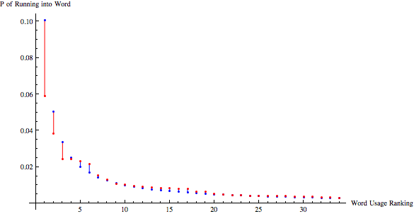
Words in Rank: {the, and, a, of, I, to, was, in, had, he, that, his, with, my, as, you, for, on, it, at, we, but, not, were, me, by, have, all, said, be, this, one, from, so, out}


Similar graph for Aeschylus' The Eumenides:


Words in Rank: {the, to, of, a, in, and, I, you, my, your, this, for, with, all, his, on, CHORUS, our, who, that, LEADER, no, from, is, by, will, he, as, You, not, we, those, their, ATHENA, have}

UNCERTAINTIES:
There are quite a few discrepancies in the Aeschylus Zipf comparison, compared to Stevenson Zipf comparison. I'm assuming this is because it was translated from Greek, and thus not applicable to English, even though written in English syntax. Also, the code I've written does not account for discrepancies in punctuation, so the counts may be off, but I wouldn't believe it to significantly affect the count. The discrepancies get noticeably less with each ranking increase, percentage-wise.

Tuesday, July 6, 2010

EKG File Processing

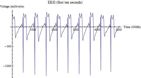
I got an EKG file from Dr. Konopka via Dr. Choi and, with it, I was to chart the change in heart rate. The patient was administered a drug which would elevate heart rate and the EKG lasted for around 5 minutes. Anyways, the easiest way I thought of to process the file was to use an If statement nested in a For loop to check if a point passed a certain threshold value (I used the refractory period to be around the point at which I counted it as a "beat" which I determined to be anything below -800). Seeing that the SA node doesn't shoot another action potential until around 500 data points later (the EKG file was take at 500Hz, so that means, about one electric signal from SA node per second), I stayed on the safe side and incremented the i value (my For loop counter) by 400. That being done, I then incremented my count value which counts the number of beats. The rest was easy-peasy: multiply count by (60/period specified by user in param).

The EKG:


First Channel:


Second Channel:


Indeed, there is a definite positive slope, so the drug, at least for those five minutes, elevated heart rate.

By the way, the graphs above, although for two different channels, have the exact same output of: {55,57,58,60,62} in regards to BPM.

Monday, April 5, 2010

Cellular Automaton Part II

Well! It kind of worked!

My algorithm actually acted like dandelions! Heh. This is just the start.

I put a limit on how much the dandelions could cluster before I reassigned that grid box as zero (1 <= dandelion < 3). Wonderful!

Images:


PS. I understand there is some kind of function in Mathematica for making CA. By the time I found out, I had already coded most of my CA and didn't want to change so I just went along with my code. Plus, this is a much more enlightening experience than just writing: CellularAutomaton[...].

Thursday, April 1, 2010

Cellular Automaton Part I

I've been working on cellular automata and have been miserably failing.

I'm trying to do what I thought to be a "basic" automaton (I'm going to abbreviate to ca).

The basic ca runs as such:
1. Dandelions live for one step
2. Dandelions spread their seeds in the grid square right above, to the right, to the left, and below. We record this data in a list where each dandelion is any number greater than one. Spreading seeds is modeled by incrementing each "seeded" square's number by one.
3. The dandelion that spread its seeds dies by decrementing one. If there was a "cluster" of dandelions, then the decrement simply decrements the cluster down one.
4. Update and go back up to step one.

This "basic" code turned out to be much more challenging than I had thought.

I actually coded all the statements to randomly seed dandelions with 1/16 probability (get random integer from 0-15 and choose say 1 to indicate presence of dandelion). Then, I used a for loop to evaluate the inner boxes (all the boxes not on the outer edges) to avoid complications and ugly coding I really didn't want to do until I knew my algorithm as a whole worked well (which it, unfortunately, didn't). The body of the for loop was relatively simple: if the grid box it's evaluating at that moment has a value greater than or equal to one, then increment the boxes around it by one. Else, give it a value of zero, and move on.

Well, the result? The dandelions proliferated in far greater numbers than even GM dandelions on steroids would have reproduced... In essence, the grid was completely yellow. Not a speck of green. Why? Well, I didn't put a check on how much the dandelions could cluster before they died. So squares could accumulate massive numbers and no matter how many times it was decremented, it was simply incremented up at chaotic values.


And, well, the complete yellow one is just a waste of space.

<4/5/10: I actually fixed the code. Look one post after, labelled Cellular Automaton Part II>

Saturday, March 20, 2010

Graph Crank

Well, I've had a pinch of time so here's my latest in Mathematica:

I received a bunch of data from a Google Survey my teacher put up for Korean moms to look at (all users of MissyUSA who are mostly Korean women immigrants in the US.) At first, I was attempting to find very unrelated variables and graph them by hand (as in typing the actual labels of the graph, and the place to find the data, etc.) However, that took a long time and was ineffective so I made a module to crank out graphs in 2D ListPlot form for numerical data points. My algorithm is as such:

Before the Module:
Since I'm using Google Surveys, I extract the data from the website published to import the "FullData".
After that's imported, we have to remove the question titles (but I kept these handy since I needed them for the next part of my code), Flatten the data, and Partition the flattened data into whatever length each person's response to all the questions were added to 2 (in this case, there were 37 questions + 1 timestamp + 1 bullet = 39 boxes). Then, take the last 37 boxes or whatever number of boxes (by using -37)by mapping it. Afterwards, for this module, you have to Select the Integers using, well, Integers, as the filter.

In the Module:
This module is solely to make ONE graph, not several, yet. We will utilize this module to make hundreds of graphs by using a for loop.
Anyways, in the module, we have five parameters: the x axis label, the y axis label, the x-axis variable number (in the survey, what question are you seeking to put on the x-axis), the y-axis variable number, and the data set to analyze (in this case, from Google Surveys). We use a for loop to make a point with one number from the x var. number question and one from the y var. number question.
We Append that point to an empty list we declare in the beginning of the Module.
After the for loop, fit a line/curve, with obviously, Fit, to the "empty list" that had all the points appended in it in the previous for loop.

Then, Plot the line and ListPlot the data points. Use the x var. number and the y var. number with a "vs." in between as the title to show what you are comparing.

For Looping:
We use a double nested loop to traverse the questions with integer responses (which we had filtered beforehand). Set one variable to the be the counter of the x var. and the other nested to be the y var. This way, we can get ALL possible combinations. Afterwards, inside the nested for loop but before using the listPlotMaker module, put in an if statement to ensure that the x and y var. numbers are NOT the same (that way, we don't have unnecessary repeats of shockingly perfect correlations). Then, just use the listPlotMaker module inside the loop to create each graph.

ALGORITHM FIN

Anyways, that was a really long-winded explanation, but it cranked out a huge number of graphs. I can't seem to find any good correlation though...

Sunday, March 7, 2010

Quick Idea Crank

Long time no see! Anyways, I've been incredibly busy lately but I should probably record possible science fair ideas:

-Computer models of biological mechanisms (Dr. Choi was talking about tree growth)
-Using tools available to society to make very odd connections (using Mathematica to crank out the graphs, I'll try looking for any correlation)
-Using Mathematica to find an author's tendency toward a specific set of vocabulary to hopefully identify works easily and maybe even write sentences (which has been shown before on Wolfram Demonstrations).

I'm out, but I'll update later if I think or receive any more interesting science fair ideas (or interesting project ideas at all).

Tuesday, February 9, 2010

School Life Survey 1 Wrap Up

School life survey 1:

Question: Are the claims of parents that social networking is harming today's generation true? How about the assumption that more "friends" really means more friends?

Hypotheses:
1. If more time is spent on social networking sites, then there will be more emphasis on social standing. (This hypothesis was just Null--no proof for or against since there was not enough data and I was attempting to use a Boolean-style approach, where Social Standing was 1 and Academic Standing 0. Came out like 2 straight lines.)
2. If more time is spent on social networking sites, then there will be less trustworthy friends.
3. If there are few friends on social networking sites, then there will be more hours spent on social networking sites.
4. If more time is spent on social networking sites, then there will be a lower weighted GPA.

These were hypotheses added on later (I made the above hypotheses on the spot as I posted my School Life Survey 1):
5. If there are more friends then there will be a lower GPA.
6. If there are more trustworthy friends then there will be less FB friends.

Data:

Hypothesis 1: Null.

Hypothesis 2:

Hypothesis 3:

Hypothesis 4:

Hypothesis 5:
(FB Friends to GPA)

(Trustworthy Friends vs. GPA)

Hypothesis 6:


Conclusion:
The data given suggests a strong negative correlation between the time spent on social networking sites and GPA. Also, there is a very slight negative correlation between the number of trustworthy friends/facebook friends and GPA. Otherwise, the data is too sparse to draw anything even semi-definitive.

Limitations/Uncertainties:
This data was taken largely from students from Mission San Jose High School in Fremont, CA. One or two points each come from Illinois and the East Coast (I do not know which points, obviously, as this was an anonymous survey, but my peers from those parts said they took the survey). Mission has a very high emphasis on academia, which leads to the relatively high amount of people who said they appreciated academic standing over social standing. Data is here: http://spreadsheets.google.com/pub?key=trtorCi2YDWnRugPcM3tkdg&single=true&gid=0&output=html